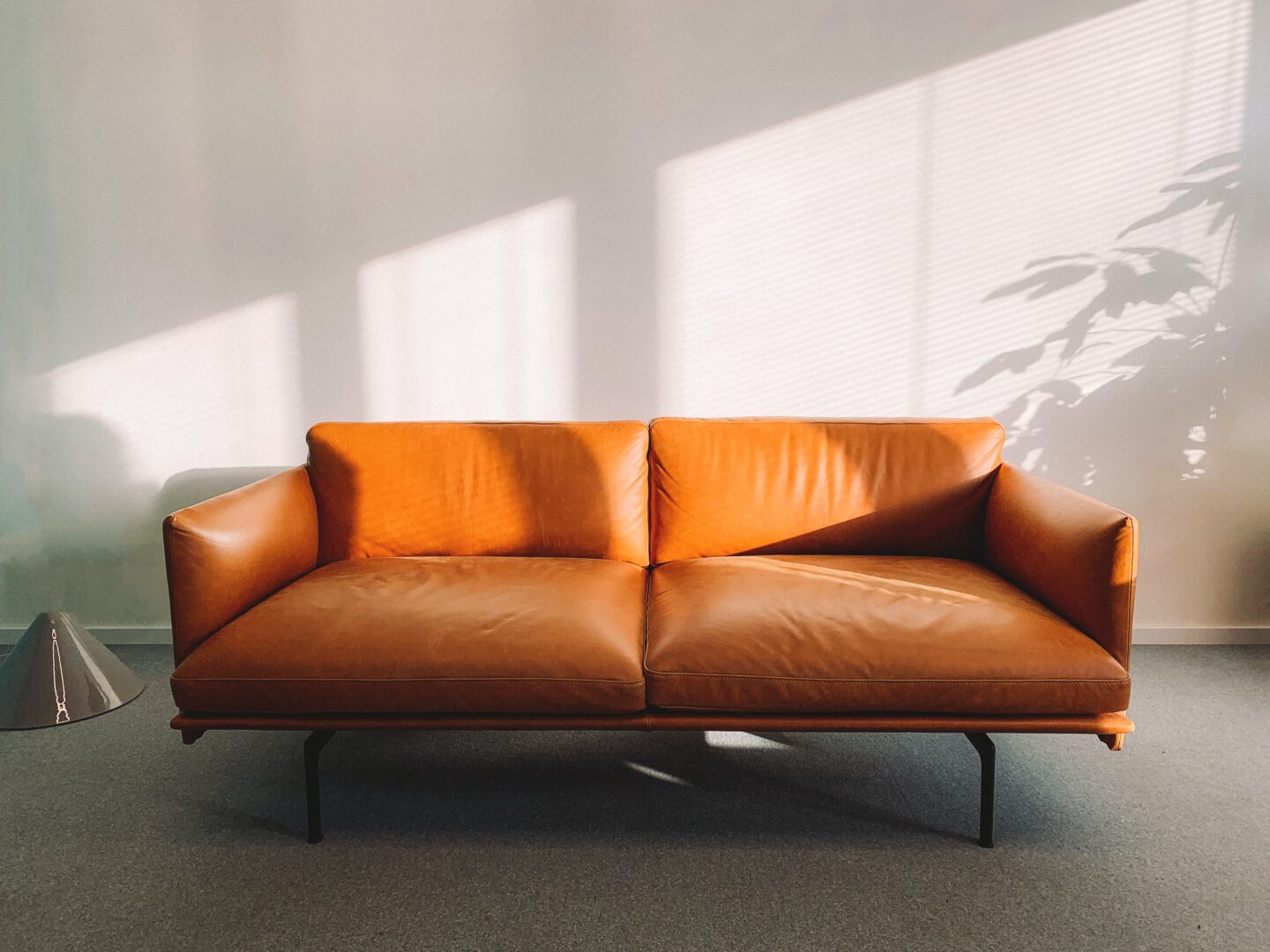
Are you ready to create a design masterpiece? Well, buckle up because we’re about to take you on a journey through the wonderful world of colour schemes and furniture.
Get ready to have your mind blown as we reveal the secrets to creating a match made in design heaven.
From neutral colours that bring calmness to monochromatic schemes that ooze sophistication, we’ve got it all covered.
So grab your cup of coffee, and let’s dive into the realm of creative genius!
Colour Schemes and Furniture Guide
Neutral Colours
A neutral colour scheme makes a good backdrop for furniture and decor because it won’t clash and lets you easily change things.
Picture this: you walk into your cosy sanctuary, greeted by calming shades of white, beige, grey, and cream. It’s like stepping into a cloud of serenity.
The epitome of comfort, your beige sofa beckons you to sink into its plush cushions. With their sleek design, the grey accent chairs add a touch of modern sophistication.
And let’s not forget the accessories! White throw pillows, like fluffy marshmallows, invite you to snuggle up and relax. And the cream-coloured rug, soft underfoot, ties the entire room together.
This neutral colour scheme is like a chameleon, blending with any desired style or theme.
Feeling adventurous? Add a pop of bold colour with vibrant accent pillows or a statement artwork. Or keep it classic and elegant with monochromatic accessories. With neutral colours, the possibilities are endless, and the results are always stunning.
Monochromatic Colours
To create a cohesive and calming effect in your space, try using different shades of the same colour for your decor. Using a single colour scheme can give your space that feeling of unity and calmness.
Here are three reasons why you should consider incorporating monochromatic colours into your design:
- Easy on the eyes: Monochromatic colour schemes are visually pleasing and easy to look at. It’s like a soothing lullaby for your eyes.
- Endless possibilities: With monochromatic colours, you have a wide range of shades to choose from. Whether you’re looking for bold and vibrant hues or subtle and muted tones, there’s a shade that perfectly matches your style and personality.
- Versatility at its finest: Monochromatic colours are incredibly versatile. Whether it’s your cosy bedroom, lively living room or even the bustling kitchen, this colour palette can rock.
Complementary Colours
You can create a visually striking effect by pairing colours that are complementary or opposite each other on the colour wheel. It’s like having a design dance-off in your living room!
Picture this: a vibrant red sofa waltzing with a delightful green accent chair. They spin and twirl, creating a harmonious and eye-catching display. And don’t forget to add coordinating pillows to make the colours pop.
When it comes to comparing furniture options, complementary colours are like the perfect duo. They bring out the best in each other. The red sofa and green accent chair play off each other, creating a playful and energetic vibe in your space.
But remember, balance is key. You don’t want the colours to overwhelm the space like an overzealous performer stealing the spotlight.
Make sure to choose complementary colours that are equally intense so they can share the stage without overshadowing each other.
Analogous Colours
Analogous colours are beside each other or shoulder to shoulder on the colour wheel, which creates a harmonious and soothing atmosphere.
To make a lively, cheerful space, go with a colour scheme that’s bright and energetic. Imagine sitting on a cosy sofa with a warm orange blanket, surrounded by various shades of yellow and orange, in your living room.
By using analogous colours, you can effortlessly create a harmonious and inviting environment.
Here are three reasons why incorporating analogous colours into your furniture can be a match made in design heaven:
- Seamless coordination: Analogous colours seamlessly blend together, creating a cohesive and unified look in your living room. The different hues of yellow and orange will complement each other, giving your space a sense of balance and symmetry.
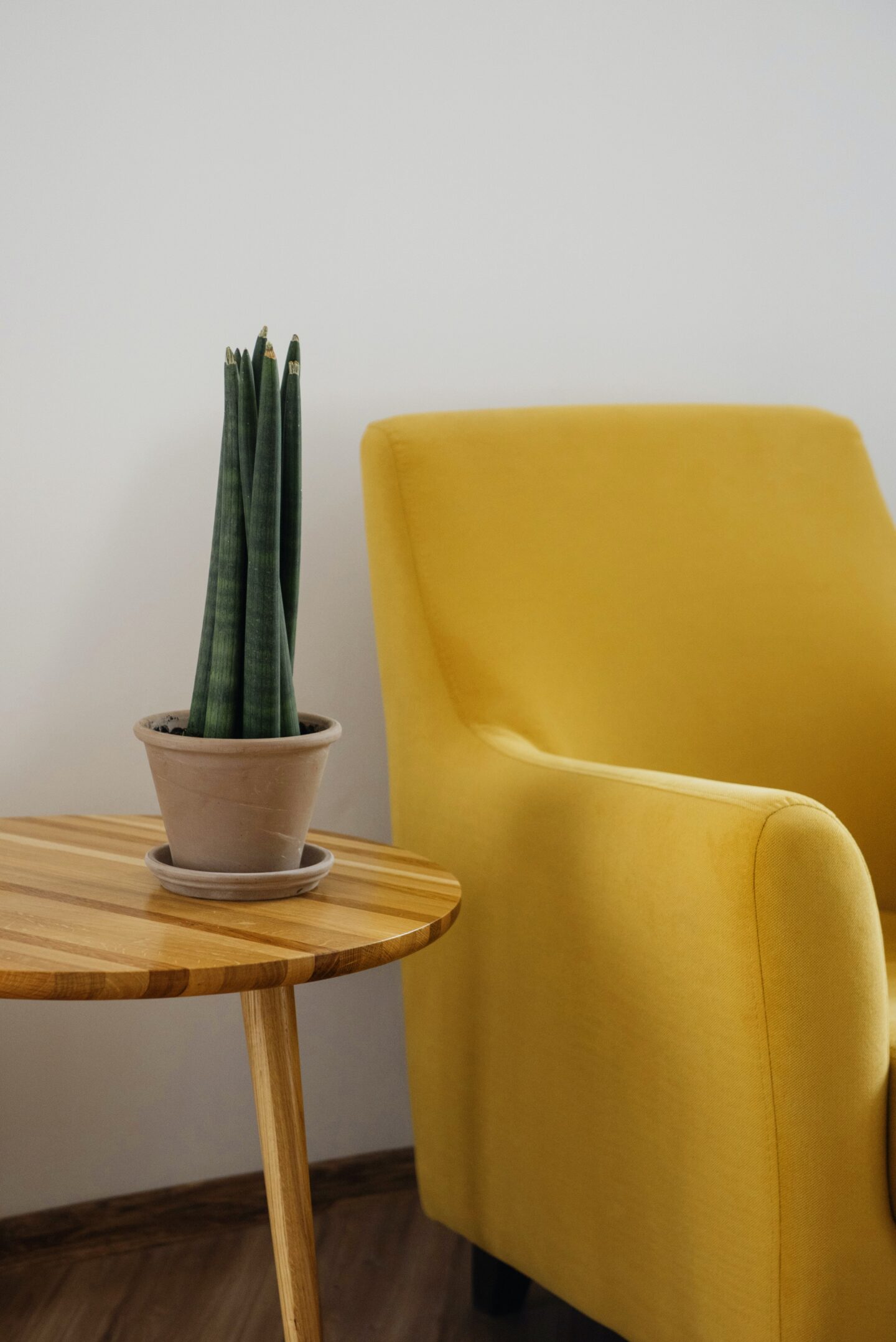
- Elevated comfort: The warm tones of yellow and orange evoke a feeling of cosiness and comfort. Imagine sinking into a plush mustard yellow sofa surrounded by burnt orange throw pillows. It’s like being enveloped in a warm embrace every time you relax on your furniture.
- Playful personality: Analogous colours bring a playful and vibrant personality to your home.
Triadic Colours
Triadic colour schemes involve using three colours that are evenly spaced on the colour wheel.
Using a triadic colour scheme in your living room can create a vibrant and energetic atmosphere that’s visually appealing.
Picture this: a bright blue sofa as the focal point, surrounded by accent furniture and accessories in fiery red and sunny yellow. It’s like having a party in your living room every day!
Frequently Asked Questions (FAQs)
How can I incorporate neutral colours into my home décor without looking dull or boring?
Incorporating neutral colours into your home décor can create a calming and sophisticated atmosphere.
Here are a few tips to prevent it from looking dull or boring:
- Play with textures: Incorporate different textures like chunky knit blankets, faux fur pillows, and woven baskets to add depth to the space.
- Add pops of colour: Neutral decor can still feature bold pops of colour in small doses, such as wall art, decorative throw pillows, or a colourful rug.
- Create contrast: Pair neutral colours with darker or lighter hues of the same colour to add interest. For example, use a lighter shade of beige on the walls and opt for darker beige curtains.
- Mix and match materials: Combine different materials, like wood, metal, and ceramics, for a diverse and exciting look.
- Incorporate greenery: Adding plants into the mix can add a fresh, vibrant pop of natural colour to a neutral room.
What are some tips for successfully using monochromatic colours in a small space?
Looking to create a stylish monochromatic look in a small space? Here’s the lowdown: First, choose a colour that speaks to your soul. Then, go all out and paint the walls, ceilings, and even the furniture in that same hue. Don’t forget to add texture and dimension with different shades and textures of your chosen colour. Finally, embrace the power of accents – throw in some bold pops of contrasting colours to keep things interesting.
Can you provide examples of complementary colour combinations that work well in a modern living room?
Here are a few examples of complementary colour combinations that work well in a modern living room:
- Blue and orange: A rich shade of navy blue pairs well with bright and bold hues of orange, creating a high-contrast and modern aesthetic in a living room.
- Green and pink: A pale green pairs beautifully with soft pink tones, creating a delicate and elegant look perfect for a modern living room.
- Purple and yellow: A deep shade of purple with a muted shade of yellow can create a sophisticated and ultra-modern look for a living room.
- Burnt umber and pacific blue: This warm neutral shade complements a cool shade of blue to create a modern but welcoming colour scheme. This works well in both minimalist and cosy modern living rooms.
Conclusion
So there you have it, a guide to colour schemes and furniture that will make your design dreams come true.
Whether you opt for neutral, monochromatic, complementary, analogous, or triadic colours, remember that the key to a successful match is to think outside the box and embrace the unexpected.
After all, who needs a match made in heaven when you can have a match made in design heaven? Happy decorating!
Thank you for reading.